In the past few years, we have witnessed the booming of mobile usage in the world. People use smartphones not only to communicate but also to access their favorite websites, search for information, shop online, etc. Browsing on PC and on mobile phones are very different in terms of screen size and experience. Therefore, to attract more people to your site, it is important to optimize browsing experience on mobile devices. So how can you do that?
There are many things needed to be done to make your site become mobile-friendly. The best solution is to count on plugins. They integrate many functions to ensure that your website appears well on mobile devices.
In this article, we will guide you through the checklist for a mobile-friendly website, how important it is to be mobile-responsive, a list of best WordPress mobile-friendly plugins, and some tips to provide better experience to your mobile visitors.
- Is Your Website Mobile-Friendly?
- How Can Mobile-Friendly Website Benefit You?
- 5 Plugins to Make a Website Mobile-Friendly
- Tips to Make Your Site More User-Friendly
Is Your Website Mobile-Friendly?
Highly responsive interface
Being highly responsive means all content on your site is displayed well on desktop, mobile phones, and other devices. Regardless of screen size, people still access the same information, probably with a slight difference in layout.
Sometimes, when browsing the web on smartphones, you may catch sight of images and texts getting zoomed out or zoomed in in an unusual way. This does not happen to responsive websites. Every element on the site will be adjusted so as to appear perfect on every device.
Easy navigation
People tend to look for specific information on your site rather than just browsing unpurposely. If it takes too long to find them and they end up getting lost in the maze of information, it is highly likely that they will leave and never come back next time. Therefore, it is important to arrange data logically and clearly so that they can easily find the things they need.
Important figures such as your contact, “who you are” section, the product you offer, etc. should be highlighted in the most eye-catching spot. Other details should also be categorized clearly. Because the screen area on mobile is limited compared to the desktop, it would be better not including too much information on one page. Instead, think about how you can navigate people to what they really need.
Fast loading
Undeniably, loading speed is one of the most important factors deciding whether a visitor stays on your site. If it takes too long to load, they may not be patient enough to wait and immediately swift to another site. Mobile-users tend to lose patience more quickly than PC users because they cannot perform other actions while waiting. That’s why you should take speed as a priority to keep people on your site. A mobile-friendly website should only take less than 4 seconds to load a page.
Optimized format and layout
The proper layout, font, and image size are essential to create a good look on your site. Your elements should not be too big or too small. A simple layout and standard fonts with proper size will be a good choice as they provide visitors with good experience and do not slow the website down.
How Can Mobile-Friendly Website Benefit You?
Attract and keep visitors on your site
Google prioritizes mobile-friendly websites on their search engine result pages. If your site is highly responsive, it is likely that you will perform better on SEO rankings and attract more visitors.
Besides, a well-organized, fast-loading, and eye-catching website provides visitors with a better experience while browsing. This encourages them to stay longer on your site. Thus, you have more opportunities to impress them, boost leads, make sales, and so on.
Make your website more professional
A website represents your business online. People tend to consider a professional website as a professional business. That’s the reason why you should take care of every element on your site. They include your website design, loading speed, content, etc. The attention to details will show people that your business is serious about every little thing. In this way, there is no doubt that a mobile-friendly website will bring out a good impression and help you with your branding activities.
5 Plugins to Make a Website Mobile-Friendly
If you are struggling with how to make your site become friendly to mobile, plugin is the best solution. Plugins add special functionalities to your website such as SEO check, e-commerce, and of course, mobile-friendly settings. Without coding skills, you can easily set up a plugin and let them take care of everything for you. Below is a list of 5 best WordPress mobile-friendly plugins that will help you stand out from the crowd.
Jet Pack
JetPack is an all-in-one plugin which equips several useful functionalities to help with security, backup, speed, and growth. Most importantly, it optimizes your website on mobile devices, including loading times, appearance, contents, etc. The plugin is updated regularly to make sure that it is compatible with other popular WordPress plugins and technological products. Undoubtedly, JetPack is an ideal choice for those looking for a multi-effect plugin, not limited to mobile-friendliness.
WP Mobile Menu
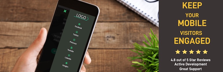
Website-builders are not always technology experts. They usually have limited knowledge about coding. In this case, a simple and easy-to-use plugin is what they look for. WP Mobile Menu is a typical example. As it shows on the name, the plugin helps with menu navigation on mobile. It provides a three-layered mobile menu to help visitors access content more easily regardless of their devices.
Besides, you may find other useful features including Logo/Text Branding, Customized Menu, Overlay Mask, Hidden Elements, etc. Depending on your needs, you can choose between the free and premium plan.
Smush
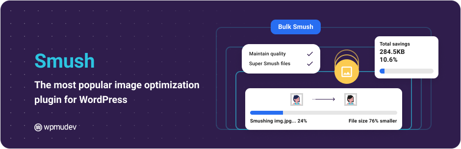
When it comes to optimizing images on your mobile-version website, Smush is an ideal plugin. The images displayed on different screen sizes may result in quality loss. Smush can help you solve this by compressing images while still protecting its quality. This also speeds up your loading time.
WP Call Button
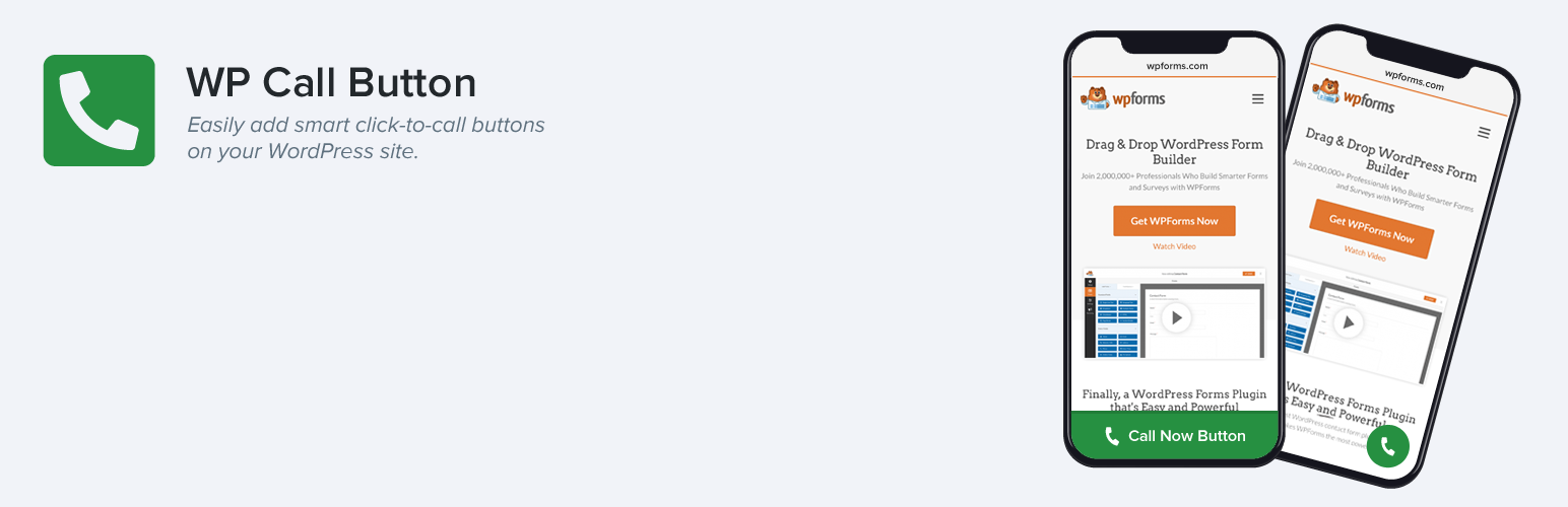
A call button is an important element on your website. WP Call Button helps you create and customize it with just a few clicks. The plugin is completely mobile-responsive. That means your button appears nicely on all devices. You can even choose to show the call button only on mobile devices. Besides, the button can be adjusted to fit your brand color and style.
Touchy
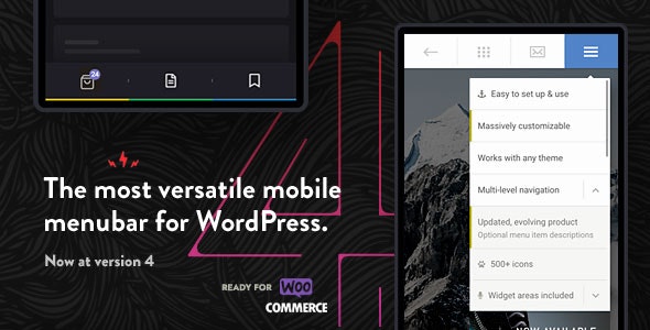
Touchy is a mobile menu and header plugin designed for smartphone usage. However, it also works well on desktops. The plugin features logo location, accessible call and email button, integrated search, multi-level drop down menu, etc. Besides, you can easily customize elements such as changing colors, positioning, and hiding bar buttons. Overall, this is a comprehensive plugin to make your website mobile friendly.
Tips to Make Your Site More User-Friendly
Aside from using WordPress mobile-friendly plugins, there are a lot more you can do to level up your website. In this section, we’ve put together some suggestions that might help you.
Use lightweight theme
One mistake that website-builders often make is to set up a theme with too many features and complicated effects. This may make your website look impressive but come with many disadvantages. Therefore, many people prefer choosing simple and lightweight themes. First, it makes your website load fast. Second, its simple interface helps visitors to navigate around the website more easily.
Check for responsiveness
The best way to check whether your site is mobile-friendly is to use the responsive checker. Google provides a Mobile-Friendly Test for you to do that. All you need is to put your URL on the bar and see how it looks on mobile devices. If the result shows that your site is not yet mobile-friendly, you will be provided a list of recommendations for improvement.
It is necessary to take the test regularly to ensure your website performs well and no error happens along the way.
Limit ads and pop-ups
One thing that irritates website visitors, especially mobile visitors, is when several ads pop up right in the middle of the screen. Sometimes, the “close” button is even too small to tap so they are transferred to another site. This might be one of the top reasons that visitors never come back to your site. The solution is to display the ads on two sides, header or footer or set the pop-ups to appear at a proper time, preferably when people finish reading.
What Is Your Favorite WordPress Mobile-Friendly Plugin?
Developing a mobile-friendly website is super important for your business to attract visitors and build a professional image to the public. You should use WordPress mobile-friendly plugins to optimize your appearance, loading speed, and other features. Additionally, checking responsiveness, using lightweight themes, and setting ads properly can also make your website become more user-friendly.
Let’s start to optimize your website now!
You may be interested in the top 5 WordPress content restriction plugins.
